Tower
Tower Records, a beloved vinyl record store, met its demise in 2006 primarily due to the rampant growth of online piracy and a failure to adapt its brand. While the mainstream appeal of vinyl records as a primary audio medium has been waning rapidly, the memory of Tower Records continues to evoke a strong sense of nostalgia among many.
Skills
Branding
Copywriting
Team Management
Layout Design
Advertising
Tools
Adobe InDesign
Adobe Illustrator
Adobe Photoshop
Adobe Premiere Pro
Team
Quinnton Barringer — Project Manager, Copywriter
Brandon Lin — Team Strategist, Copywriter
Emily Ho — Graphic Designer, Advertisement Designer
Claire Nitchman — Photographer
Research
Our redesign journey satrted with a thorough evaluation of Tower Records' existing brand. It became evident that the current brand lacked a cohesive and distinct identity, with the exception of the recognizable red and yellow color scheme. Consequently, our objective was to construct an entirely new visual style, starting from scratch. We envisioned a brand new logo, a compelling voice, captivating photography, and a distinct style. The outcome was a potent and purposeful identity aligned with the newly-branded Tower's strong voice and intentional design.
Root for the underdog
Talk to people like they’re people
Don’t apologize for being different
Be inspired by the community
Our Approach
In our pursuit of creating the ultimate brand for Tower, we made a conscious shift away from materialistic record-selling methods, prioritizing what truly matters: people's music. While we retained the iconic Tower Records colors and slogan to preserve brand equity, we decided to drop the "Records" from the name. This strategic move empowers us to explore and expand into diverse markets while staying true to our heritage.
Visual Identity
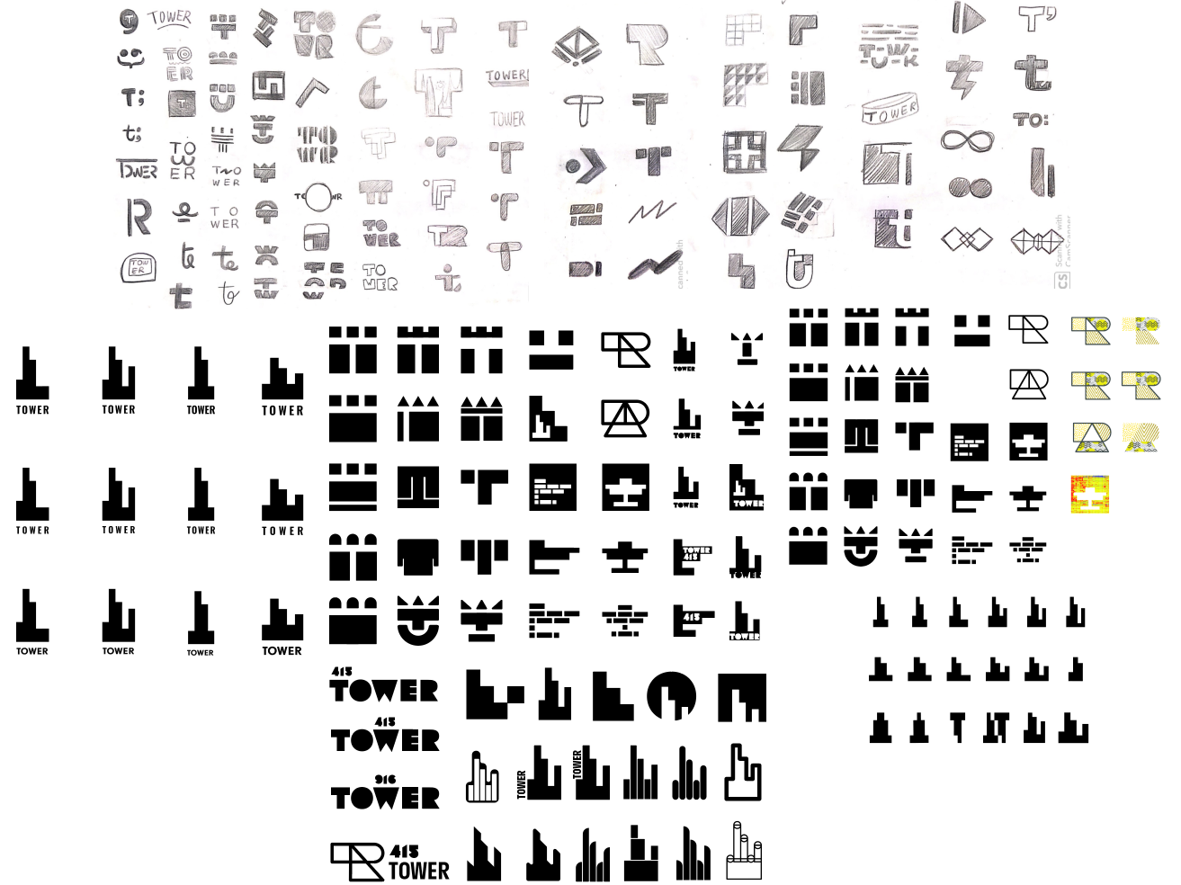
We discovered our concept through a deep exploration of sound, its origins, and the way it was traditionally conveyed. Infusing this exploration with a sense of nostalgia and a sophisticated, modern typeface, we were captivated by a singular design that truly resonated with us.

The Branding Guidelines Book
The identity guidelines for Tower served as the cornerstone of this project. This meticulously crafted book succinctly defines what Tower represents, highlights the transformative changes, and eloquently explains the rationale behind our decisions. One hundred and ten pages of beautiful photography, dynamic typography, and eloquent words make up one hell of a brand reimagining, and perfectly captures the new direction for Tower.
Flip through on Issuu